The untitled history of the human condition - Review
Writer - Michael Gatti
Artist - Tyler Carpenter
Michael and Tyler give the comic book format a makeover that doesn't fully work.
Writing
This story is told from a third person perspective however it is not explained who is telling this story. It is clear this is a narration which is a clever if not cliched idea. The narration tells a majority of the story, however there is a lack of emotion and depth to the text. The monotone narration then spills over onto the characters as even though they have some forms of depth it is not enough to connect with.
The narrative is also told in two ways the first with the narration and the second with speech balloons in the images. This is a fantastic idea if it had consistently as with some speech in the images and some in the narration it felt disjointed.
There are parts of the book where the narrator will break character and compare an event to another product out there like Disney or Vampire diaries. This just feels irrelevant and out of character. These narration breaks also point out plot holes and where the story foreshadows. This seems like a really bad humor ploy that really misses it's mark. A comic shouldn't have plothole and if it does it shouldn't point them out to the reader.
Art
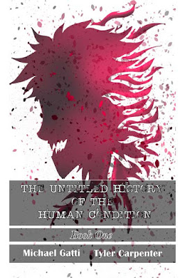
The art here suits the theme of this story perfectly. The monotone art keeps the tone dark and give the writing atmosphere. I would of liked more art work in this comic as even though there's a drawing a page they don't tell alot of narrative as they just illustrated what we had just read.
The artwork is also character driven which is good but I would of prefered to see more of the surrounding area and different locations that were in this comic.
Overall
Overall this is a really good idea and story that just fails in it's execution. While reading this I thought it was more of a synopsis of a story rather than a finish story. With a second issue in the works maybe the issues with the character differentiation and tone. I also feel there isn't a clear target audience as the way it is written suggests a young audience but the graphic nature of the story suggests otherwise.
Art - 3.5/5
Writing 2/5
Overall 2.5/5
Disclaimer
I was approached by the writer to do this review and received a copy for review purposes.
Artist - Tyler Carpenter
Michael and Tyler give the comic book format a makeover that doesn't fully work.
Writing
This story is told from a third person perspective however it is not explained who is telling this story. It is clear this is a narration which is a clever if not cliched idea. The narration tells a majority of the story, however there is a lack of emotion and depth to the text. The monotone narration then spills over onto the characters as even though they have some forms of depth it is not enough to connect with.
The narrative is also told in two ways the first with the narration and the second with speech balloons in the images. This is a fantastic idea if it had consistently as with some speech in the images and some in the narration it felt disjointed.
There are parts of the book where the narrator will break character and compare an event to another product out there like Disney or Vampire diaries. This just feels irrelevant and out of character. These narration breaks also point out plot holes and where the story foreshadows. This seems like a really bad humor ploy that really misses it's mark. A comic shouldn't have plothole and if it does it shouldn't point them out to the reader.
 |
| Front cover of this issue |
Art
The art here suits the theme of this story perfectly. The monotone art keeps the tone dark and give the writing atmosphere. I would of liked more art work in this comic as even though there's a drawing a page they don't tell alot of narrative as they just illustrated what we had just read.
The artwork is also character driven which is good but I would of prefered to see more of the surrounding area and different locations that were in this comic.
Overall
Overall this is a really good idea and story that just fails in it's execution. While reading this I thought it was more of a synopsis of a story rather than a finish story. With a second issue in the works maybe the issues with the character differentiation and tone. I also feel there isn't a clear target audience as the way it is written suggests a young audience but the graphic nature of the story suggests otherwise.
Art - 3.5/5
Writing 2/5
Overall 2.5/5
Disclaimer
I was approached by the writer to do this review and received a copy for review purposes.


hey great review I'm the author here's my reply!
ReplyDeletehttps://youtu.be/pbW8lvdCMX8