Here is the process I went through when creating my characters. Hope this is informative and not that if these don't make the final cut they may show up elsewhere in my projects.
 |
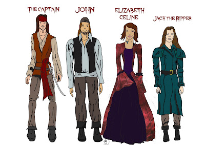
| These are the original characters I intend to use in Black Voyage. Jack the Ripper and Elizabeth are the final designs however The Captain & John are not. The Captain does appear in the 1st issue and that design is the one being used throughout the comic. John is an initial design and I didn't want to spend this time working on him so I am going to produce a final design for him over december so next semester when he will be used there will be a final design. |
 |
| This is the original design of Elizabeth. I decided to change the facial features on her alot as here she looked too average and innocent. I gave her shorter hair as it made the character more unique and stand out among the rest of the characters. |
Jack the Ripper did not always look the way it did. Below are a selection of designs I produced for Jack. Some of these designs are drawn with greater detail than the final design however the overall feel of the designs didn't feel right that is why I chose the final design.
 |
| With these designs I decided to look at not including a coat. This look worked as it still looks like male clothing but they still had their female body shapes. I went for the slender body type as Jack needs to be nimble and athletic. The aspects I don't like about these designs is that they don't look right with a hat & the fact they look like female versions of sweeney Todd. |
 |
| The design on the right is the final design I did of Jack this design was a more profile shot of the previous design. I added a coat and I think this improves the design and it has it's own originality to it instead of looking like a reimagining of a character like the previous designs did. |
During this issue Jack interacts with two ladies of the night. The design above is one I quite like this design however I think I did her legs too short and it is out of proportion. Below are more designs I did along with the final designs.
 |
| With these designs I decided to have a curvier body type as that was more of the norm in the 1800s. I think this looked worked perfectly. I used the same face I used in my unused Jack designs to see if it worked here, I think this design work better than that of Jack. I like the other design on the left however the face lacks any detail. |
 |
| These are the final designs I did before I drew the final characters. I decided that with there being two characters I would change the body size on one character. I liked this approached as it differentiates the characters. I think the design on the left is good however she looks too posh and wouldn't be considered a prostitute, that is the kind of feel I want from the character but there is no hint here she is a lady of the night. I decided to do a behind view of the previous design as I liked that design and wanted to have a fuller view of the character.. |
Final designs
 |
| This is the final design for Rosie. I went with the slender body type. I like this design as there is that air of mystery to this design which is what I intended. The dress design is scruffy and looks that that of a woman who is poor however it is not sultry to suggest she is anything other than a poor woman. |
 |
| This is the design for the unnamed prostitute Jack meets. I keep the design similar to previous designs however I decided not to include any designs on the dress as that may show class and wealth which I don't want. I also went for a more sultry costume design. This was the tell the read that she is definitely a lady of the night. |
I like these designs as they are different from each other and they have meaning behind there designs.


Comments
Post a Comment