Major spoilers ahead
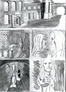
Throughout the process of creating Black Voyage I have made creative changes to panels or pages. This has improved there readability and visual appeal. Here are some of the pages with the biggest differences to them.
 |
| The original pencils, panel 3 didn't work as I had hoped so when it came to inking I chose a different design. |
 |
| Here in the inked version I changed Panel 3 to a single shot of Jack as it distinguished Jack from the prostitute. It also allowed room for the text that will go in that panel. The previous design didn't leave that room. |
 |
| This is the original page which will have text going around the page, However in this state there is no context to the visual narrative and the text that will go on the page. |
 |
| I used some unused designs for Rosie to act as prostitutes standing on street corners. I think this improves the page dramatically. |
 |
| This is the original page. I quite liked this page however there was no motion in the piece. Panel 4 lacked the conviction of a ship going through a portal. The overall flow of the page works but the quality is not there. |
 |
| This is my favorite page of the whole comic. I created the effect on panel 1 &2 by experimenting with the blur tool on Photoshop. I think is a much improvment on the original as there is more motion and the scenes are more believable. I changed the color of the portal so it will show up when printing. Finally I changed the perspective and placement of both the ship and portal. This created a more engaging panel. I also redrew the ship giving it alot more detail making it on par with the rest of the art in the comic. |
I hope these changes were insightful and if you'd like to see how I created the smoke effect comment below and I'll make a post.
© 2016 Tom_Mosby_Guilfoyle


Comments
Post a Comment